CYCLOMEDIA · COMPETITOR INTELLIGENCE · 2026
The information was already there.Nobody had time to read it.
I designed a system that reads competitor news for a geospatial company, decides what actually matters, and only then interrupts someone.
ONE DAY OF MONITORING, AS THE SYSTEM REPORTS IT
Illustrative prototype data — the pipeline is designed, not running.
SOURCES
4
SCRAPED
248
AI FILTERED
84
SCORED
84
ROUTED
12
PUBLISHED
7
248 things happened. 7 were worth someone's morning. Everything I designed lives in the gap between those two numbers.
ROLE
UX designer, solo
CLIENT
Cyclomedia (freelance)
TIME
One month
PROTOTYPE
Lovable
OUTCOME
Accepted
HOW I GOT THE JOB
I emailed a company I wanted to work with, showed them my portfolio, and sat through four interviews to find out whether I was good enough. Then they said yes, handed me a brief, and gave me a month.
No team. No design system. One manager, and a document telling me what they wanted.
01 — THE PROBLEM
Cyclomedia drives 100 cars around the world photographing streets. Their competitors don't send a memo.
Cyclomedia maps roads and infrastructure — over a million kilometres a year, sold to city councils, utilities and insurers in more than 30 countries. Big company, offices in the Netherlands and the US.
Meanwhile their competitors are busy too. Someone launches an AI feature. Someone quietly drops their price. Someone wins a contract in a city Cyclomedia was hoping to win. All of this is public. All of it is findable. And nobody has three hours a day to go find it.
My brief asked for an automated tool that checks competitors and sends a short weekly update to Microsoft Teams. It also contained one sentence in capital letters that I ended up taping to my brain:
'Do NOT start with UI components. Start with system thinking.'
Fair enough. So I did. And then I immediately made a completely different mistake.
02 — VERSION 1
I built a beautiful homepage for a product nobody needs to be sold.
My first version opened with a proper marketing page. Big headline. Hero image. A menu with Product, How It Works, Company. A Log In button in the corner. It looked like a real startup.
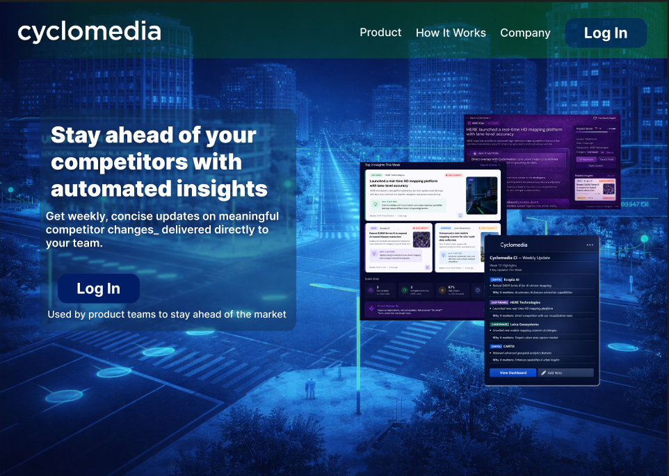
V1 — THE LANDING PAGE
'Stay ahead of your competitors with automated insights.' Nice line. Written for a customer who does not exist.
Then I thought about who would actually type this URL. Cyclomedia employees. People who already know what the tool is, why it exists, and who asked for it. I had built a shop window for a room that only staff can enter.
So I deleted it and folded it into the login screen instead. One page: you arrive, you log in, you're in.
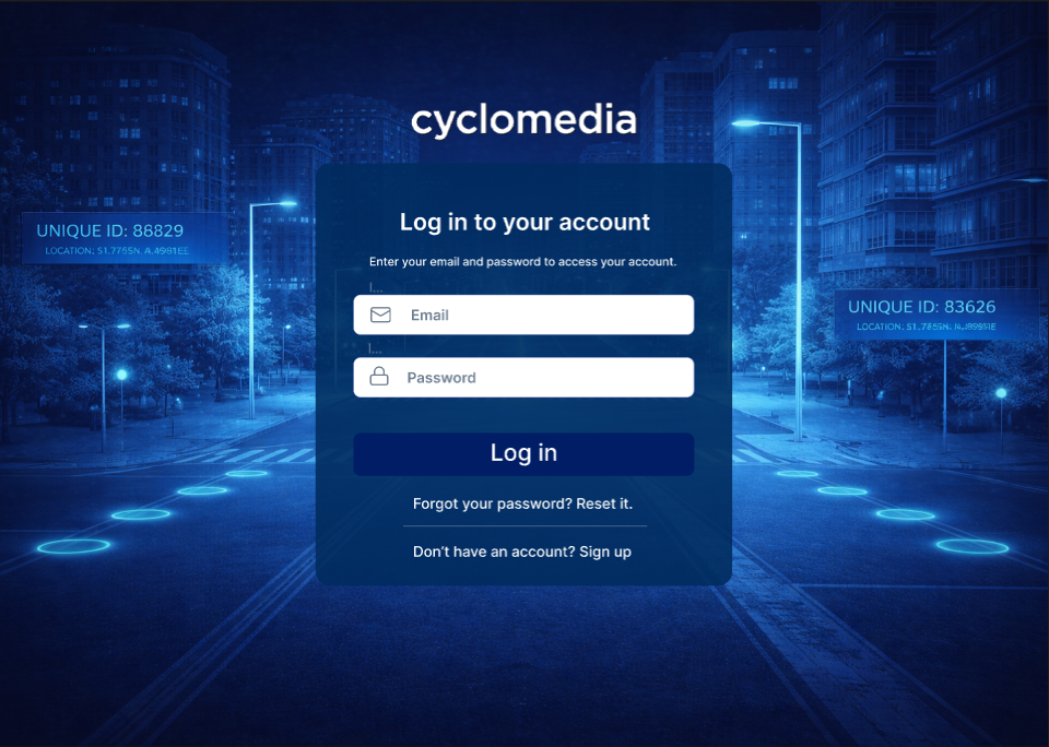
V1 — LOGIN
Two separate pages doing one job.
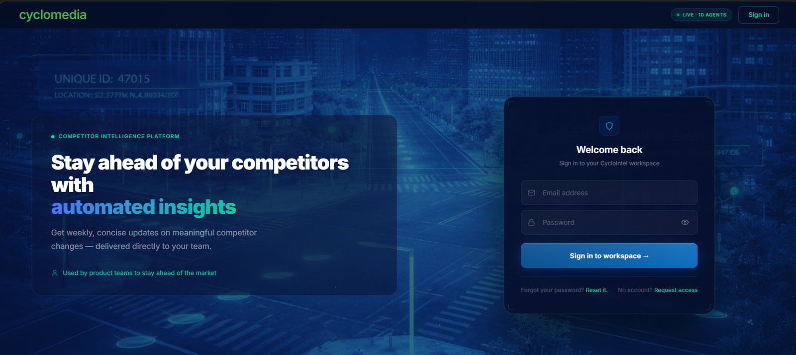
FINAL — LOGIN
One page. The message lives beside the form.
WHAT I ACTUALLY LEARNED
Internal tools don't need convincing, they need getting out of the way. I spent two days designing for a visitor who was never coming.
The dashboard underneath it was closer to right. It already had the two ideas that survived all the way to the end: a category tag (Software, Hardware, Data) and an impact level on every update — and a "Why it matters" line explaining the news instead of just reporting it.
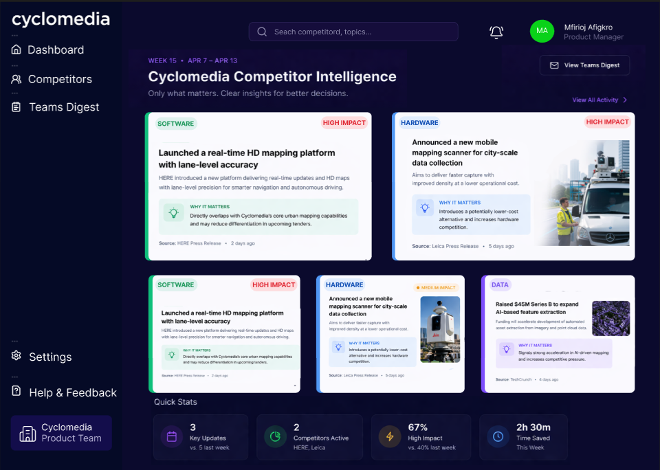
V1 — DASHBOARD
Cards in a grid. Which quietly fights the whole idea: if the system has already put the most important thing first, why am I laying them out side by side like they're equal?
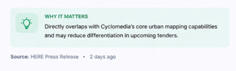
KEPT
'Why it matters.' This one idea became the heart of the product.
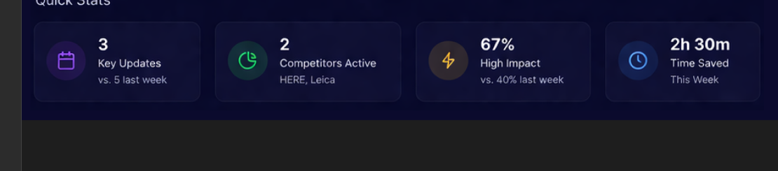
CUT
'Time Saved: 2h 30m.' I invented that number. I had no way to measure it, so it had to go.
03 — VERSION 2
Then I built something that looked very intelligent and told me nothing.
For the second version I went full analyst. A market activity chart across twelve weeks. A donut showing what kind of signals were coming in. A watchlist with little status labels. Big numbers across the top: 28 competitors tracked, 1,284 sources scanned, 98% AI confidence.
Honestly? It looked great. It looked like a product with a sales team.
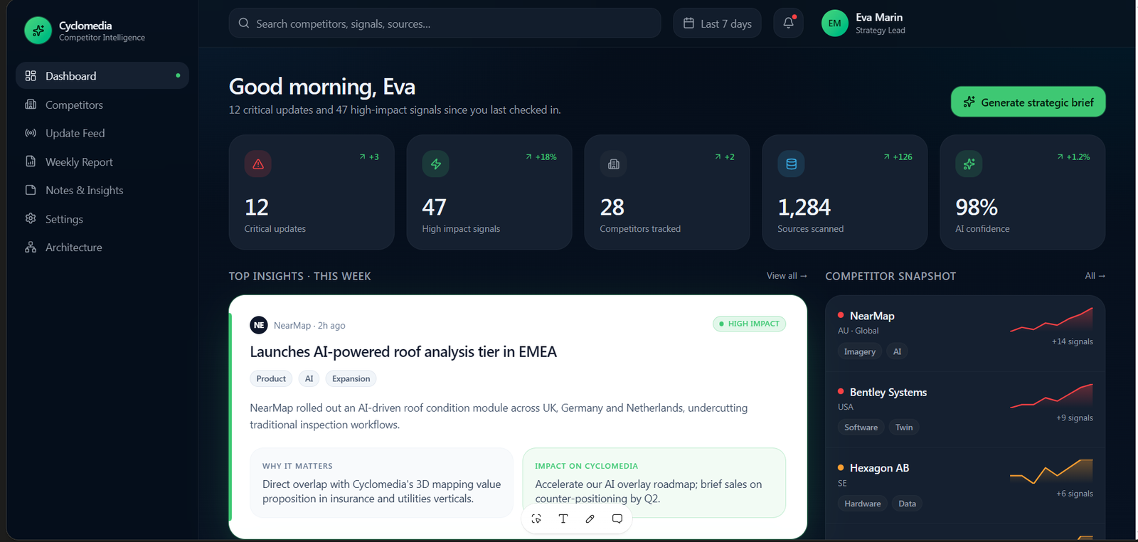
V2 — DASHBOARD
Five big numbers, a feed, and a competitor sidebar with trend lines. Impressive at a glance.
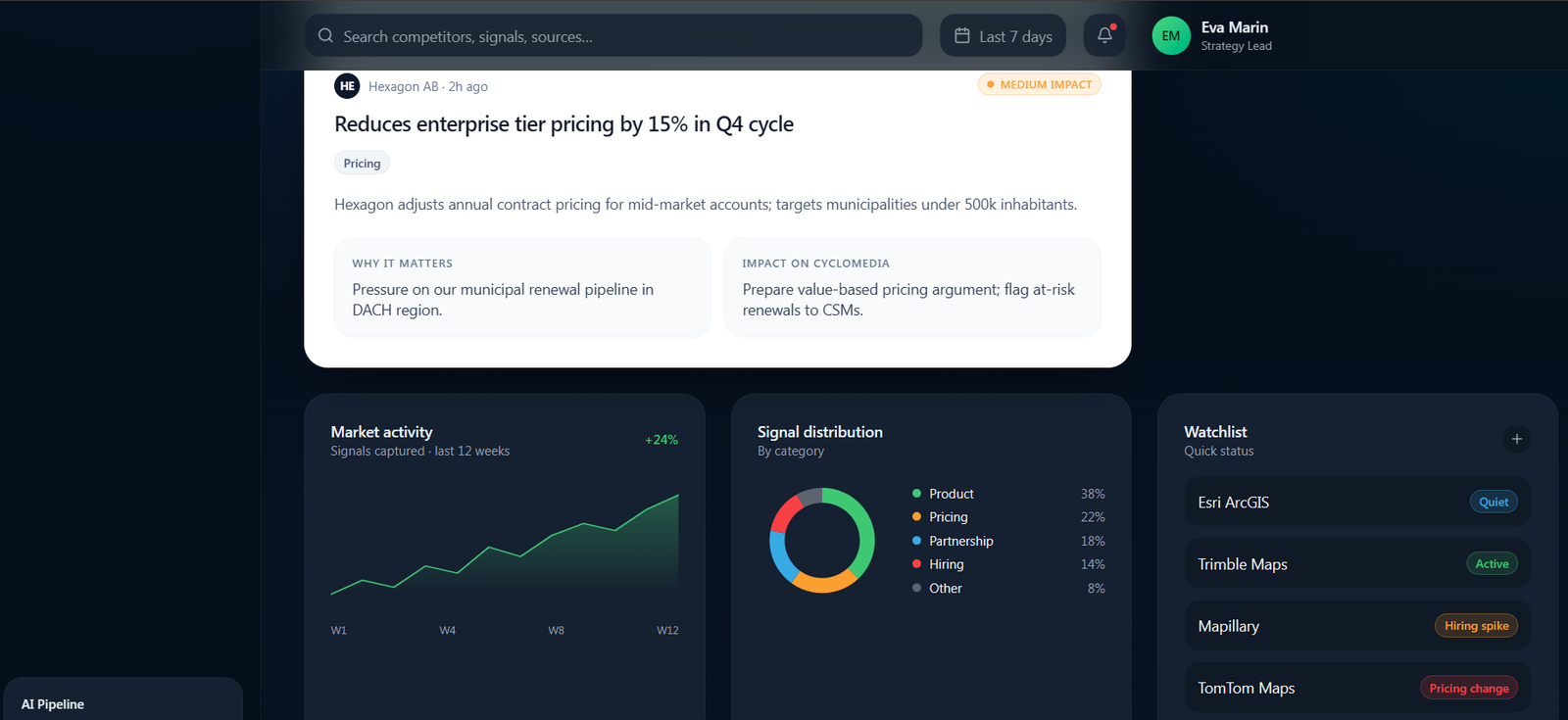
V2 — THE ANALYTICS
Market activity, signal distribution, watchlist. Three cards I was very proud of.
Then I sat in front of it and asked myself one boring question: the donut says Pricing is 22% of signals this quarter — what do I do differently today?
Nothing. I do nothing differently. I look at it, I feel informed, and I go back to work.
If a chart can't change what someone does on Monday, it's decoration with a tooltip.
The charts went. So did "1,284 sources scanned" and "98% AI confidence" — huge numbers that sound like proof but can't be checked. In the final version the numbers got smaller and honest: 8 competitors, 4 sources, and a real running cost.
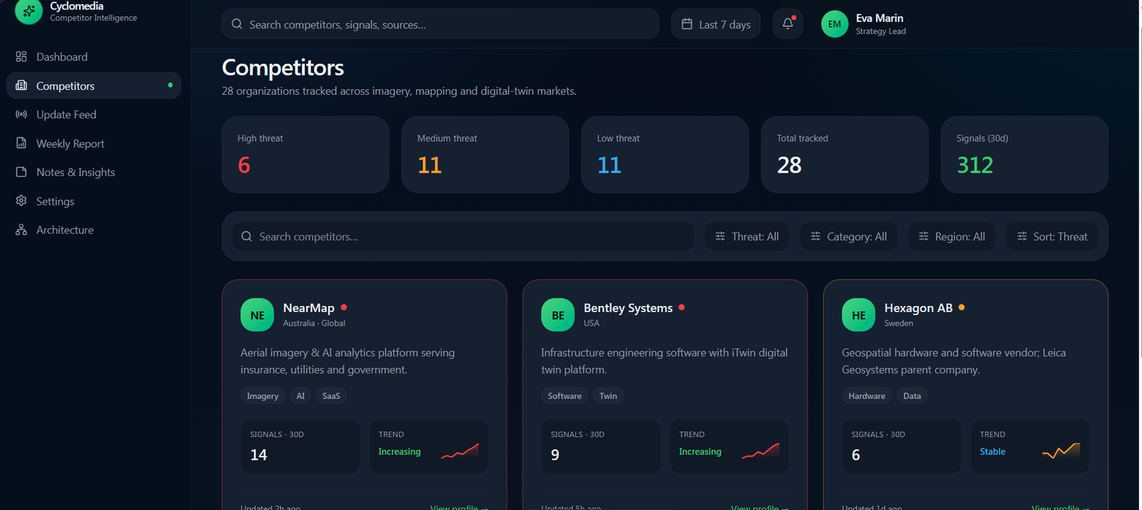
V2 — COMPETITORS
This page rated everyone High, Medium or Low threat. Useful instinct, wrong home — I moved threat level onto each competitor's own profile, where it's context rather than a way to sort a market.
04 — THE DISAGREEMENT
My manager wanted a like button.
I said no.
Her idea: put thumbs up, thumbs down and comments on every update. Popular items float to the top, and the reactions help the system learn what's important.
It's a reasonable idea. I still thought it was wrong, for three reasons.
First, the whole product exists because the AI already does the filtering, carefully, with a score. If I then let votes reorder the feed, I've built a popularity contest on top of a judgement I just spent a month designing.
Second, votes and comments are work — and my brief specifically said the system must not depend on people maintaining it.
Third, a loud team can out-vote a quiet one. The signal that matters enormously to two people in Sales gets buried by the one everyone finds interesting.
So I proposed three smaller things instead: mark it Relevant (a quiet nod to colleagues, no ranking power), bookmark it for yourself, and share it with someone who needs it.
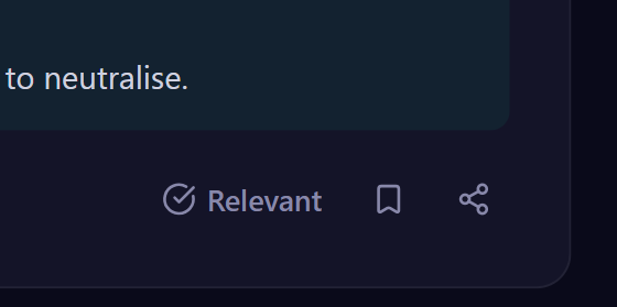
FINAL
Three actions. None of them changes the order of the feed.
05 — WHAT I BUILT
The final version starts with a subtraction.
Seven signals came in. Four are worth your time. That's the first sentence of the product, before any data appears, because the filtering is the feature.
And every update answers two questions, not one. What happened — and then So what: what this means for Cyclomedia and what to do about it. "Ecopia dropped their price 18%" is news. "Expect pressure on the Texas and Florida renewals where they're shortlisted — lead with the 5-year cost calculator" is something you can use before lunch.
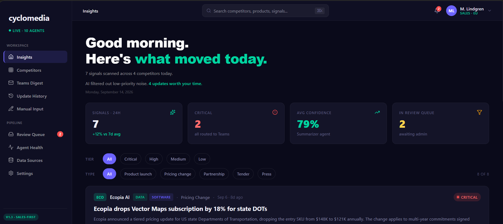
INSIGHTS
'7 signals scanned. 4 updates worth your time.' One column, most important first, and it ends — no infinite scroll.
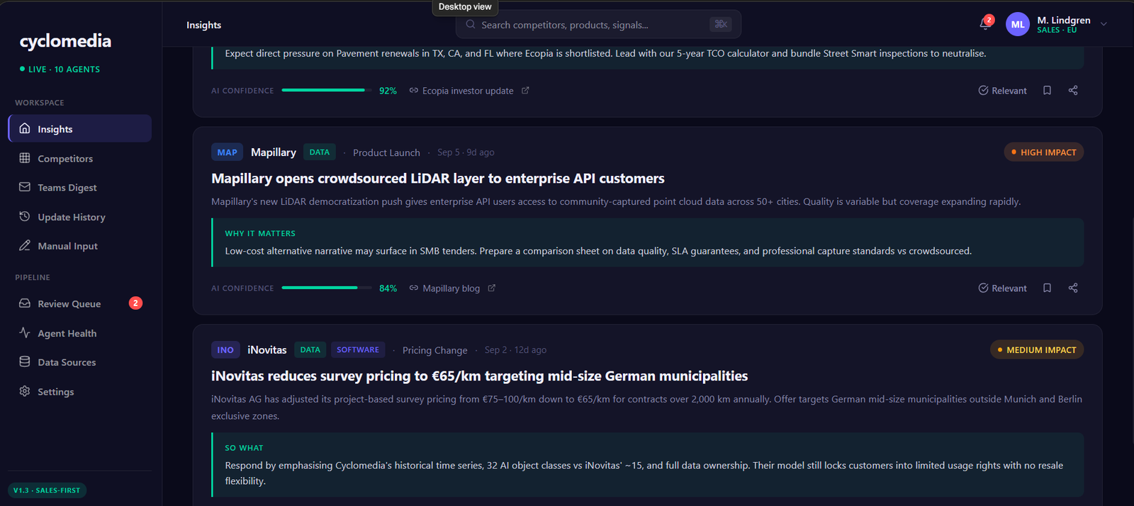
A SIGNAL
Who, what type, which layer of the market, how big, the fact, the 'so what', how sure the AI is, and the source. Enough to act or to ignore without clicking anything.
06 — THE PART I'M PROUDEST OF
The system says out loud when it isn't sure.
My earlier version had one number in the header: 98% AI confidence, forever. It comforts nobody. It tells you nothing about this update — the one you're about to forward to your boss.
So confidence moved onto every individual signal. 92%. 84%. 88%. And once it lives there, something new becomes possible: the system can notice when something is very important and not very certain — and refuse to publish it.
'Ecopia reportedly in talks to acquire StreetScan for $28M — unconfirmed.' Confidence: 41%. Two blog posts, no press release. A human decides this one.
That's the Review Queue. Rumours that would matter enormously if true don't go out automatically. Someone approves, rejects, or edits them first.
And it keeps the receipts: 14 reviewed this month, 11 approved, 3 rejected — including a HERE acquisition rumour that turned out to be nonsense. Those three rejections are the reason to trust the other eleven.
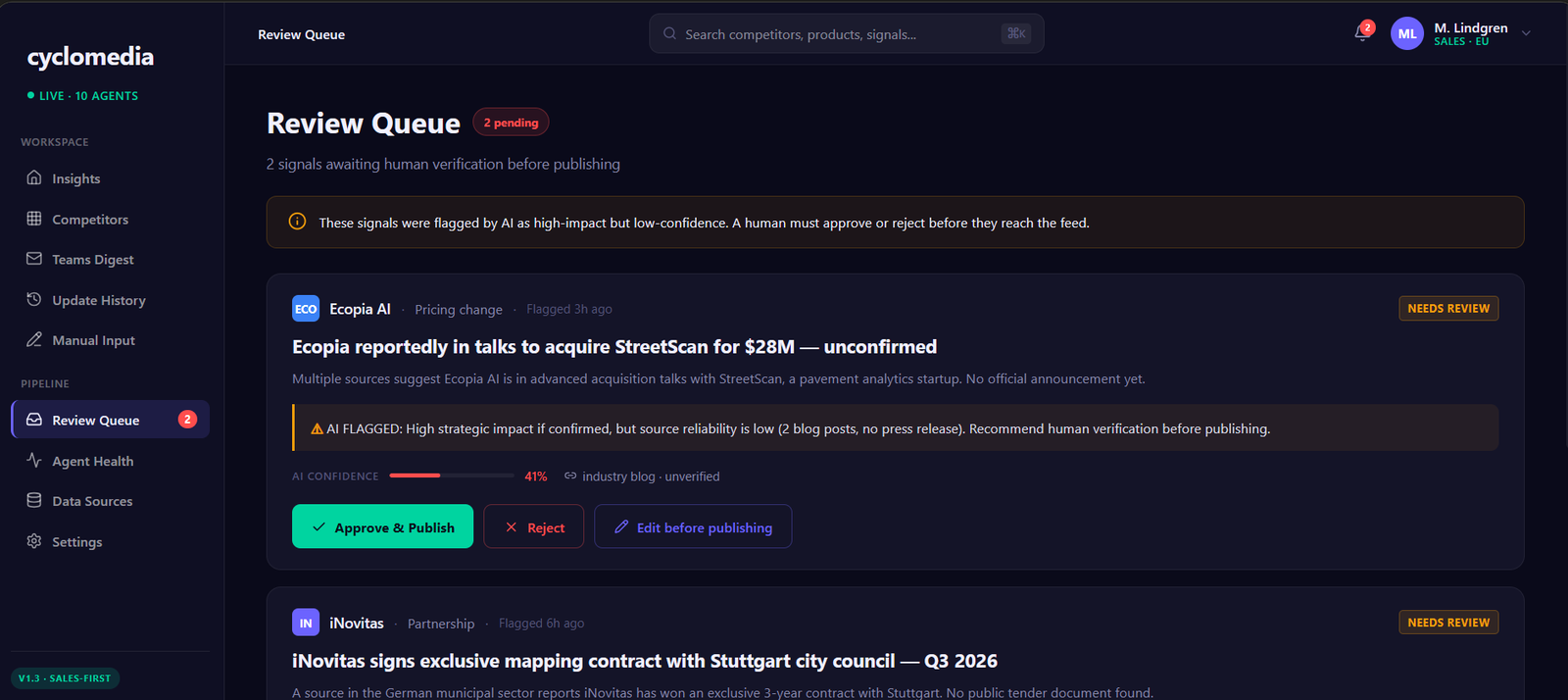
REVIEW QUEUE
It explains itself: 'source reliability is low — 2 blog posts, no press release.'
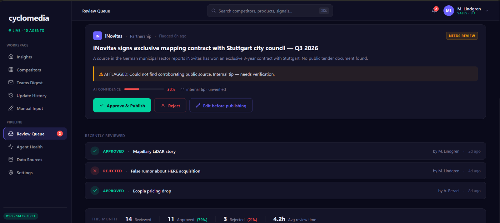
THE RECEIPTS
A visible rejection rate, including the one it got wrong.
07 — WHO'S READING
A price cut is an emergency for Sales and background noise for Engineering.
This was the idea I liked most and it's embarrassingly simple: the system already knows who just logged in. So it should know what that person cares about.
Sales weights pricing changes and tender results high, product launches low. Product does the exact opposite. Same signal, one pipeline, different priority depending on who it reaches — and it lands in a different Teams channel for each team. Leadership gets summary only, because seniority means less detail, not more.
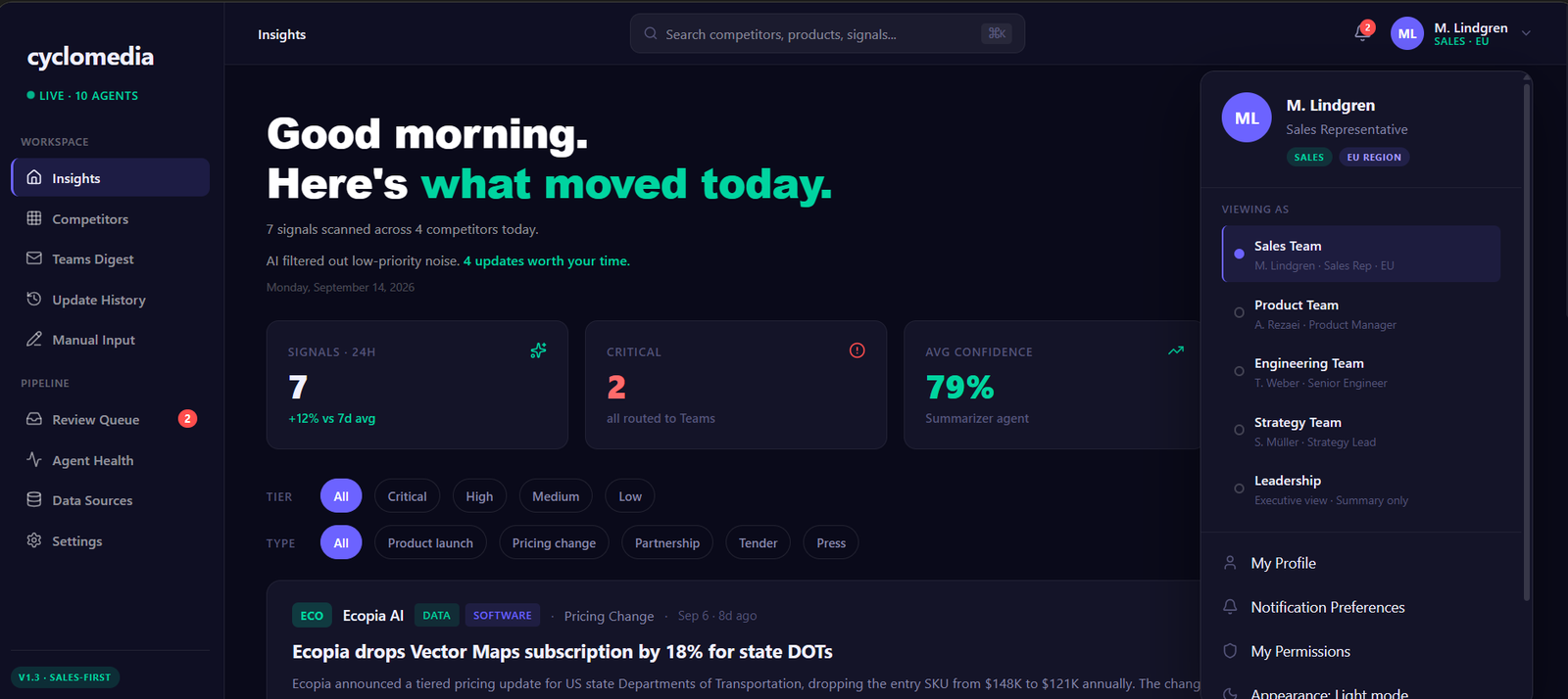
VIEWING AS
Five audiences, one pipeline. In the prototype you can switch teams to see the weighting actually change.
08 — USING WHAT THEY ALREADY HAD
Cyclomedia had already written the answers down.
They keep battle cards — documents on each competitor with their pricing, their weaknesses, and prepared counter-arguments. Good documents. Also frozen in time from the day they were saved.
My brief said use them, so I did — as the system's background knowledge. That's what turns a summary into an argument. Here's the actual trace:
WHAT THE BATTLE CARD ALREADY SAID
iNovitas, Switzerland. Surveys at €60–100/km. Customers get limited usage rights — the data stays theirs. Around 15 AI object classes, versus our 32. No historical time series.
WHAT THE SYSTEM WROTE
"iNovitas cuts survey pricing to €65/km for mid-size German municipalities." So what: lead with our historical time series, 32 AI classes against their ~15, and full data ownership. Their model still locks customers in.
Nothing there is invented. It's Cyclomedia's own positioning, pulled out at the moment it became useful.
And it works the other way too. If the card says a competitor is weak at AI and they then ship three AI features, that contradiction is itself worth knowing. So the profile is built as a living page: the stable knowledge in tabs — including Battle Notes — and the live signals running down the side.
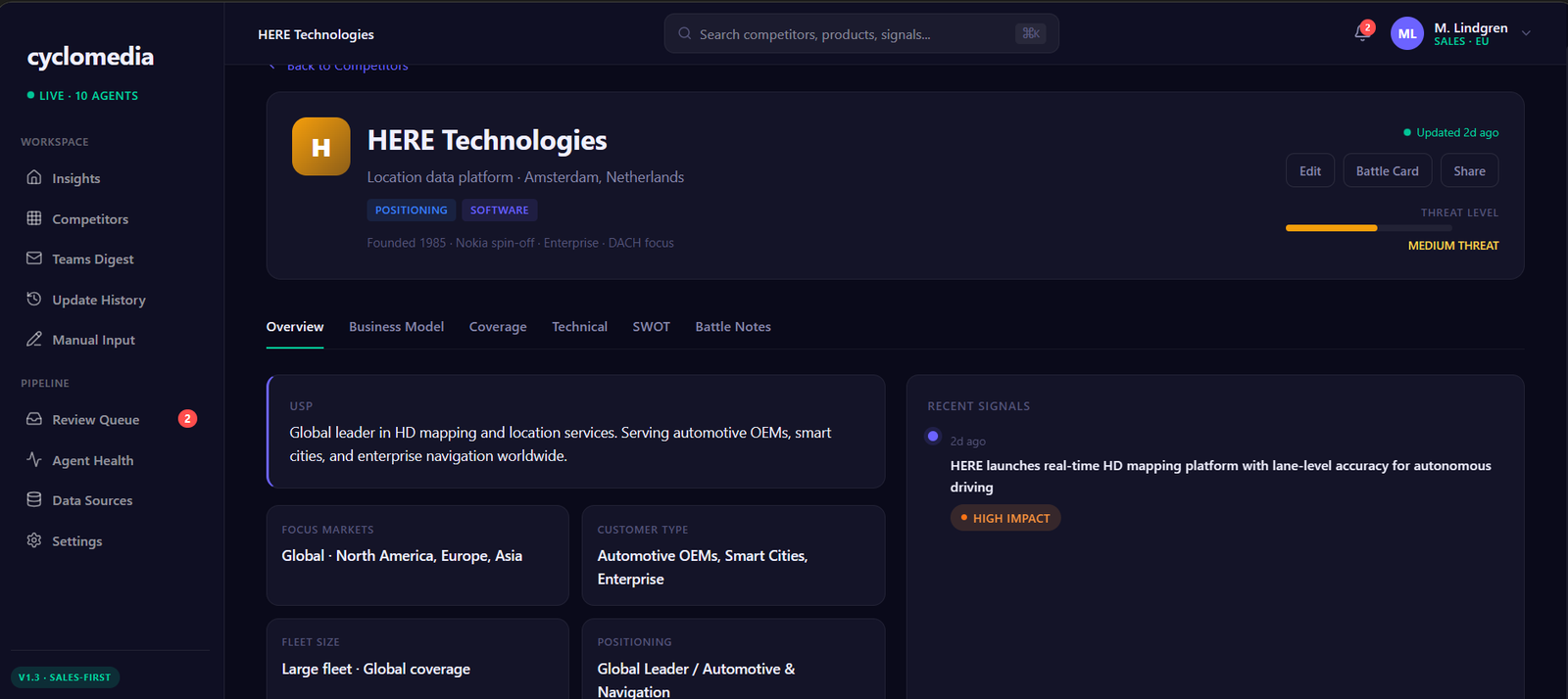
COMPETITOR PROFILE
The battle card's own sections became the tabs. Nobody has to learn a new document.
One more thing about competitors: in this industry the dangerous one usually isn't the obvious one. A camera manufacturer is harmless right up until the day it adds AI analysis and lands in your business. So competitors are organised by where they sit in the value chain — hardware, positioning, data, software — and one company can sit in several at once.
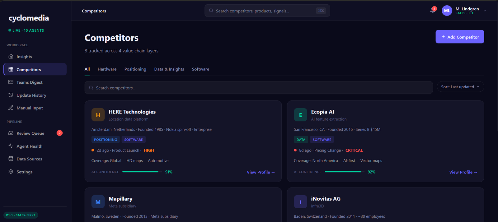
COMPETITORS
The tabs are the market's structure, not a filing system I invented.
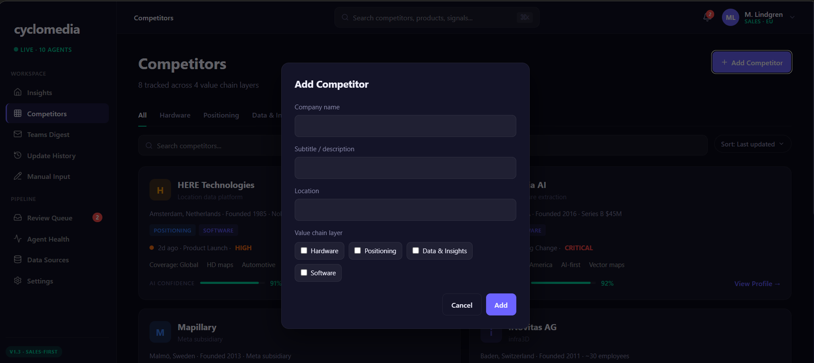
ADDING ONE
Checkboxes, not a dropdown — so a company that moves into your layer can be recorded as doing exactly that.
09 — BORING BUT IMPORTANT
A robot that breaks silently is worse than no robot.
Here's the nightmare: a scraper stops working, the feed gets thinner, and a quiet week looks exactly like a broken system. Everyone keeps trusting it while it watches nothing.
So the machinery is visible where it needs to be. Ten agents, each with a success rate. One is rate-limited. One has been offline for two days and says so in red, with a restart button. I left the broken one in the prototype on purpose — a screen full of green ticks would prove less.
Same for money. Every service is listed with what it costs: about $169 a month, all in. If someone has to justify this tool to a finance team, that's a design problem too.
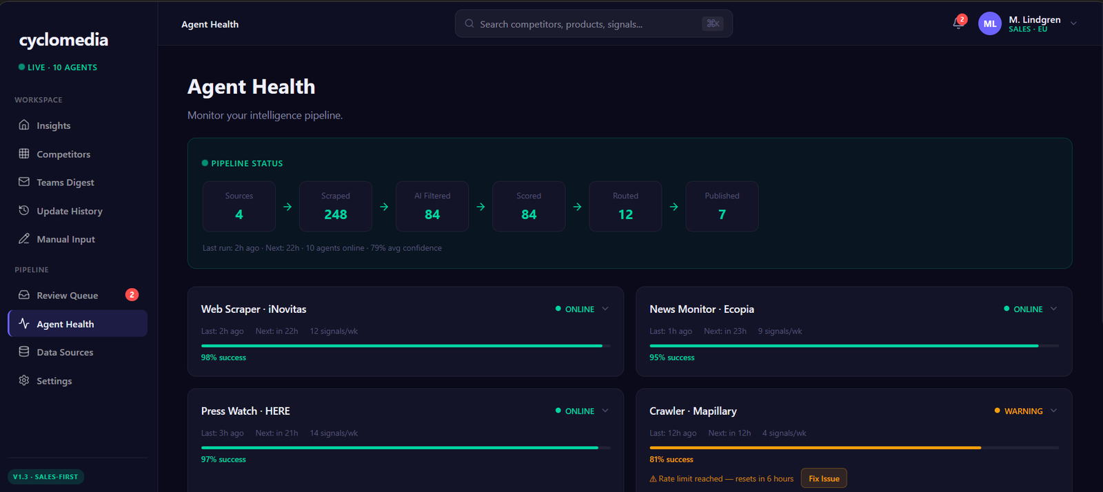
PIPELINE
How much got thrown away.
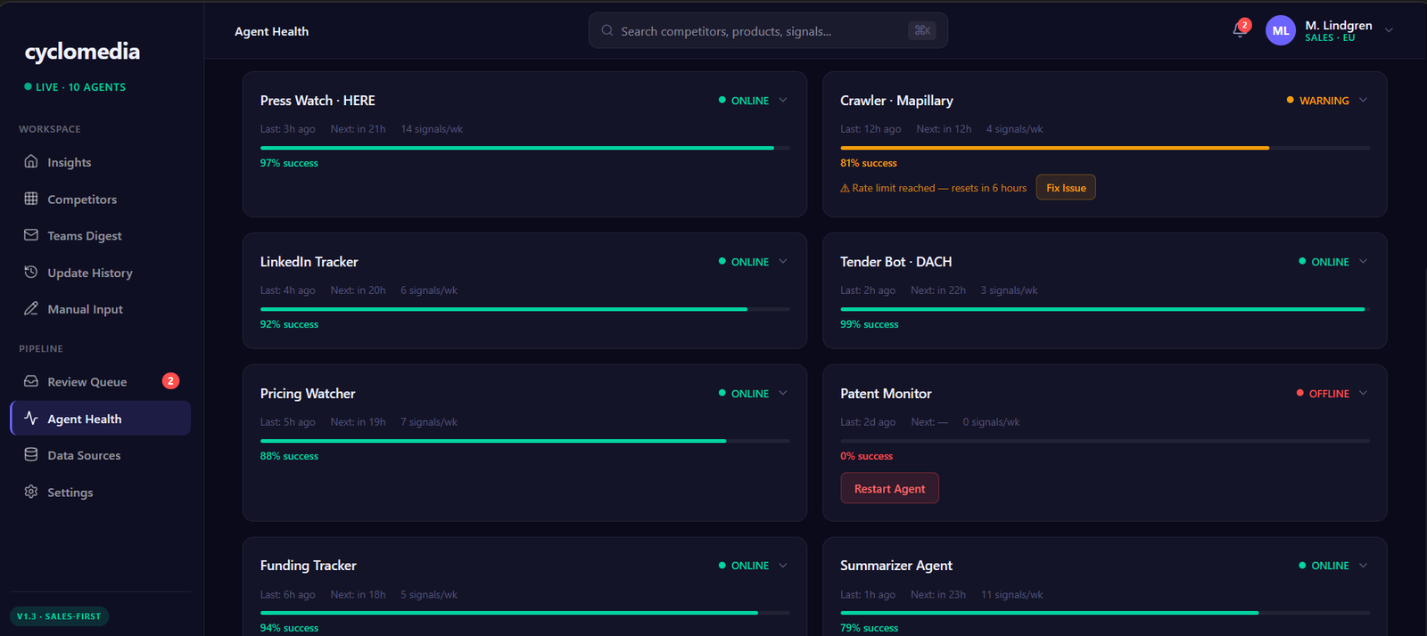
AGENT HEALTH
One offline, 0%, two days.
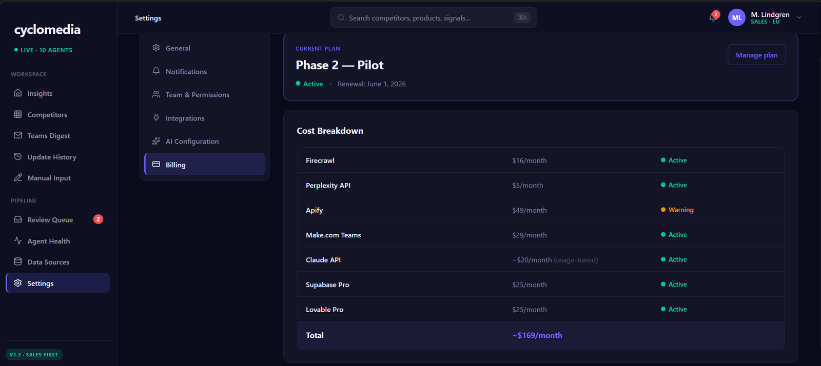
COST
$169/month, itemised.
10 — WHERE IT ENDS UP
The real product isn't the dashboard. It's a message on Friday morning.
Building a dashboard is the easy answer, and it sneakily hands the work back to the user: here's everything, go find what matters. The brief wanted the opposite — a short weekly update in Microsoft Teams, three to five items, readable in under five minutes.
So the digest is the product and the dashboard is where you go when you want more. Intelligence should turn up in the app people already have open, not in one more thing to remember to check.
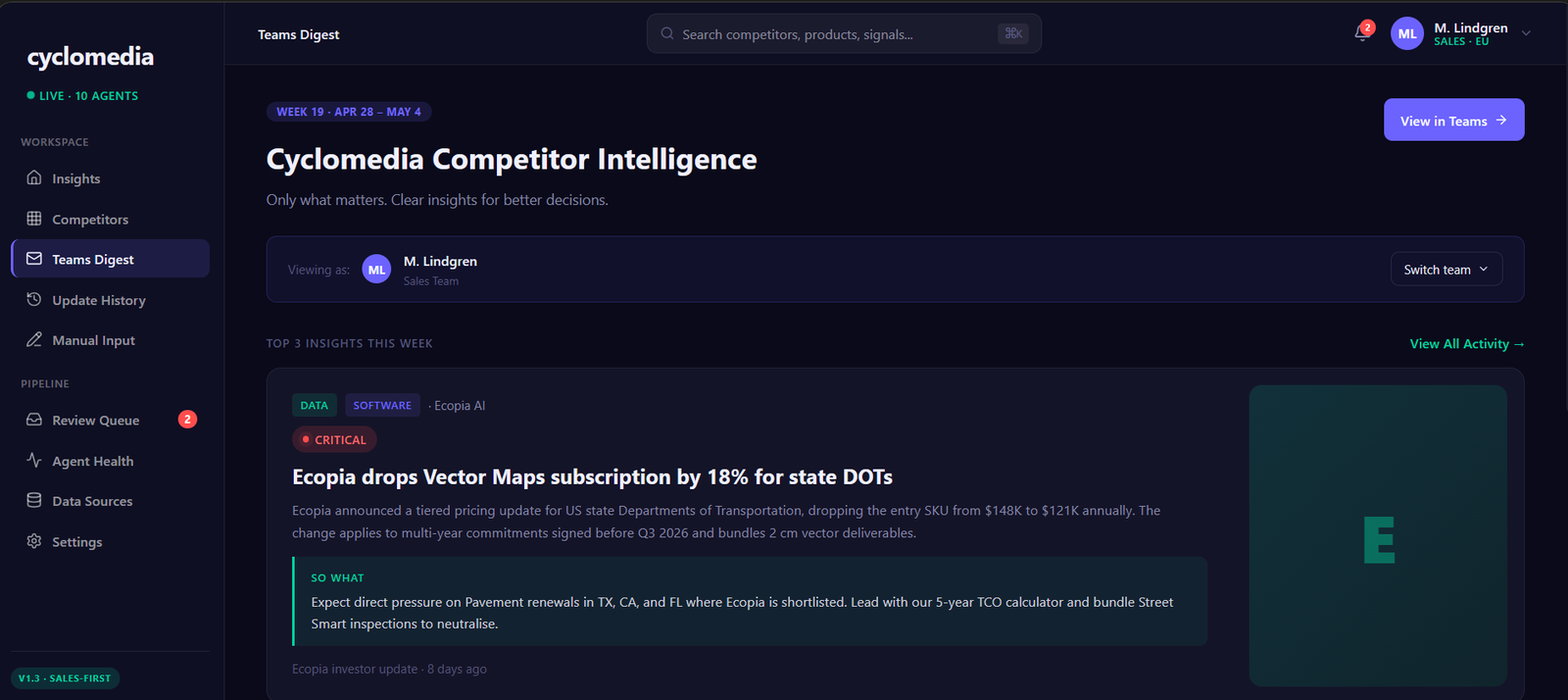
WEEKLY DIGEST
Top three. Not top twenty. 'Only what matters' is the promise the whole system exists to keep.
11 — HONESTLY
What's real, and what I'd check next.
BEFORE ANYONE ASKS
REAL
The research, the way competitors are modelled, the signal categories, the scoring and routing logic, the trust rules, and a working clickable prototype.
MADE UP
Every competitor update and number inside the prototype. The pipeline is designed, not running.
UNTESTED
Whether people trust a score a machine gave them. That's the big one.
If this got built, three questions would decide whether it works — and none of them is answered by a prettier screen.
01
Do people trust the impact score? I'd give five colleagues 30 signals to rank by hand, then compare their order to the system's. If they disagree wildly, the scoring is wrong and everything downstream is theatre.
02
Is weekly fast enough? I'd take ten real competitive decisions and work backwards to when the signal first became public. If most had a deadline inside a week, the cadence is wrong.
03
Does anyone actually clear the review queue? If those uncertain signals sit there for days, the safest part of the system quietly becomes the most ignored.
I presented all of this in the final meeting. They accepted it.
What I'd take into the next project is smaller than the project itself: the hardest part wasn't collecting information or designing screens. It was deciding what "important" means, and then being willing to throw away 241 things out of 248.
Romina Veisy — UX & Product Design
Automated competitor intelligence platform, designed for Cyclomedia. Prototype built in Lovable. Competitor names are real public companies; the battle-card content shown here is illustrative.