SAMENSTAD
UX case study · Civic technology · 's-Hertogenbosch, NL
Samenstad
samen (together) + stad (city) — "your city, fixed together"
Every city reporting app opens with the same question: what is broken? Samenstad opens with a different one — where are you standing? That single reversal turns six neighbours filing six identical complaints into one issue a municipality can actually act on, and gives the street a way to fix what the budget cannot.
ROLE
Founder · Product & UX design
TEAM
Two co-founders — design & engineering
SCOPE
Research, IA, flows, UI, design system, business model
PLATFORM
iOS & Android · DigiD sign-in
STATUS
v1.0 concept complete · in partnership talks
01 / THE GAP
One dark street,
six identical reports
KERKSTRAAT · TUESDAY, 18:45
A streetlight goes out on a residential street in Den Bosch. By the weekend six people have noticed it: a parent walking children home, a student on a bike, a shop owner locking up, three neighbours who simply live there.
Each of them opens the municipal reporting app. Each one answers the same form. Each one describes the same lamp in slightly different words, at slightly different coordinates, in slightly different categories.
The municipality now holds six tickets. Somebody has to read all six, work out that they are one lamp, close five of them, and route the survivor. None of the six people is told any of this. So the street stays dark, and next week somebody reports it again.
That is not a technology problem. It is an information-design problem: the app never let those six people see each other.
THE THESIS
A report is not a private message to the city. It is a public object standing on a street corner — and everybody who walks past it should be able to see it, confirm it, follow it, and add to it.
02 / RESEARCH
Three parties,
three different frustrations
I looked at the problem from every side that touches it: the people who report, the department that receives, and a third party nobody had invited yet.
What I did. A teardown of the apps Dutch residents already use — BuitenBeter, Fixi, MijnGemeente, Verbeter de Buurt — walking the same imaginary streetlight through each of them. Street conversations in Den Bosch with residents across three generations, including a 74-year-old who has never finished a report form and a wheelchair user for whom a blocked pavement is not an inconvenience but a wall. Desk research on how a Dutch municipality actually processes a melding openbare ruimte, and what happens to it when the maintenance budget for that category is already spent.
01 The duplicate trap
Everyone reports into the dark. Nobody can see that the issue already exists, so the same problem arrives many times — and the queue gets longer while nothing new is learned.
02 The black box
People described sending a report as "throwing it into a hole". No status, no owner, no visible end. After one silent report, most people stop reporting at all.
03 The lonely reporter
One person complaining is a complaint. Fifteen people confirming the same dark street is evidence. Existing apps quietly destroy that evidence by keeping every report private.
04 The budget wall
The most uncomfortable finding: plenty of issues are seen, accepted and understood — and still not fixed, because this year's budget for that category is gone. The queue is not always the bottleneck. Money is.
05 The form is the filter
Long forms select for the young, the literate and the persistent. The people most affected by a broken pavement are often the least likely to complete six screens about it.
"I reported it. Nothing happened. So now I just walk around it."
RESIDENT, 68 — STREET INTERVIEW, DEN BOSCH
This sentence became the brief. Not "make reporting easier" — reporting was already easy enough. Make reporting worth doing. That meant designing for what happens after submit far more carefully than for the form itself.
03 / DESIGN PRINCIPLES
Five rules the product
is not allowed to break
01 Location first, complaint second
Nothing can be reported before the street has been seen. The map is not decoration — it is the duplicate filter, and it is the first screen.
02 One place, one issue
A second report of the same lamp should become weight on the first, not a new ticket. Confirming is as valuable as reporting.
03 Status is the product
Who has it, what stage it is at, what happens next. Everything else is packaging around that promise.
04 Privacy is a switch, not a policy
Name, anonymity, notifications, community sharing — four toggles the reporter controls in the moment, not a document they never read.
05 No dead ends
"No budget" is not an answer. If the city cannot fund a repair, the platform must offer another route to it.
04 / VERSION 0.1
The raw first build —
and what it got wrong
Greyscale, deliberately ugly, built in a few days to argue with. Its job was to make the ideas visible enough to attack.
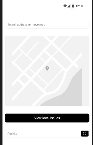
v0.1 — Home
Search address or move map
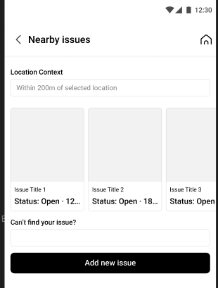
v0.1 — Nearby
Issues within 200 m
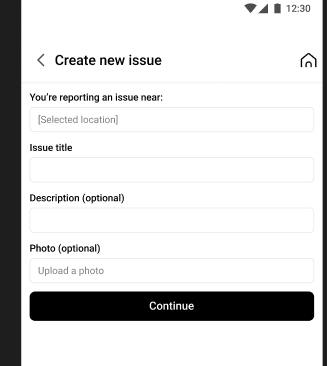
v0.1 — Create
Title, description, photo
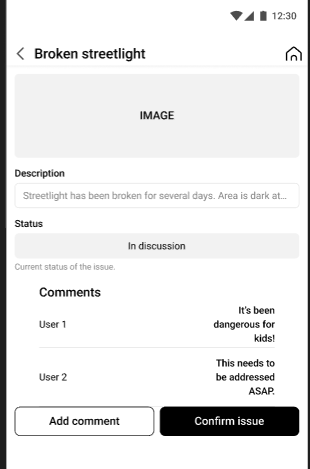
v0.1 — Detail
"Confirm issue"
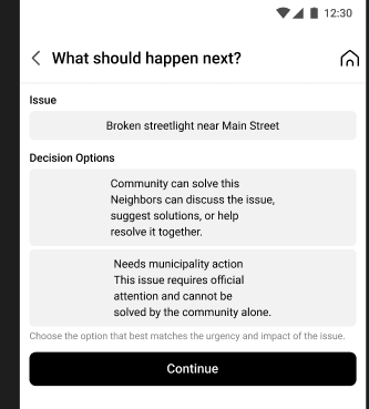
v0.1 — Routing
"What should happen next?"
Fig. 01 — The first concept, five screens
Everything that survives into v1.0 is already here in embryo: the 200-metre radius, the confirm-instead-of-duplicate button, and the idea that an issue has to be routed to somebody.
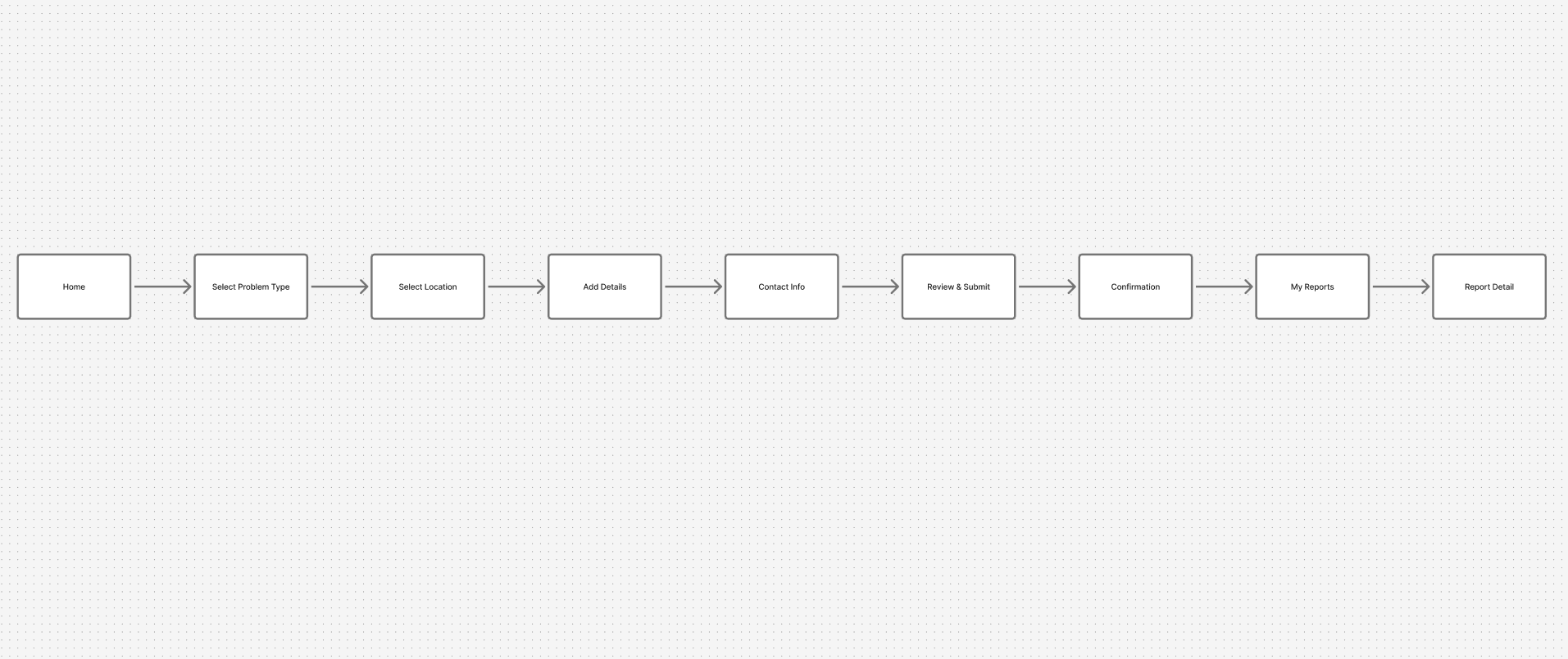
v0.1 — User flow
Home → Problem type → Location → Details → Contact → Review → Submit → Confirmation → My reports → Report detail
Fig. 02 — The flow that exposed the flaw
Nine boxes, one straight line, no branch anywhere. Drawn out like this, the first version admits what it really was: a funnel, ending at a personal archive. A city is not a funnel.
What v0.1 taught me
01 Right instinct, wrong moment
"What should happen next? Community can solve this / Needs municipality action" asked the reporter to make a jurisdiction judgement they have no way to make. The routing idea was good; asking a tired citizen at 18:45 to do it was not. In v1.0 routing became a structured choice of category + responsible authority, with the app carrying the consequence.
02 "Confirm issue" was the whole product, hidden in a corner
It sat as a secondary button on a detail page almost nobody would reach. The duplicate-prevention idea deserved to be the architecture of the app, not a button — so it became the second screen in the flow.
03 The line had no room for other people
A linear flow can only model one user. Comments, following, confirmations and a municipality replying all needed a place to live, which meant the issue — not the report — had to become the centre of the system.
04 Greyscale hid the hierarchy problem
With no colour, everything was equally important. The moment I introduced the map pins, categories needed a colour language, status needed a second one, and the whole thing needed a design system rather than a screen-by-screen aesthetic.
05 / THE REFRAME
From a funnel
to a place
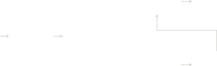
v1.0 keeps one straight path for the person in a hurry, and opens a branch at the exact moment duplicates are born: the instant before you write a new report.
Scroll across to explore the full diagram →
Sign in
DIGID · EMAIL
Home · map
TYPE · PIN · VOICE
Nearby issues
WITHIN 200 M
THE DUPLICATE FILTER
Issue page
CONFIRM · COMMENT
Follow
SAVED TO ACTIVITY
New report
PHOTO · CATEGORY
Submit
BECOMES PUBLIC

IT EXISTS
IT IS NEW
PUBLISHED TO THE SAME PLACE
EVERY PATH ENDS IN A PUBLIC ISSUE PAGE — NEVER IN A PRIVATE INBOX
Fig. 03 — v1.0 user flow
The branch sits between "I have a location" and "I am writing a report" — the only place in the journey where a duplicate can be prevented rather than cleaned up afterwards.
06 / THE DESIGN
Screen by screen
Seven surfaces. Each one had to answer a research finding, not just look finished.
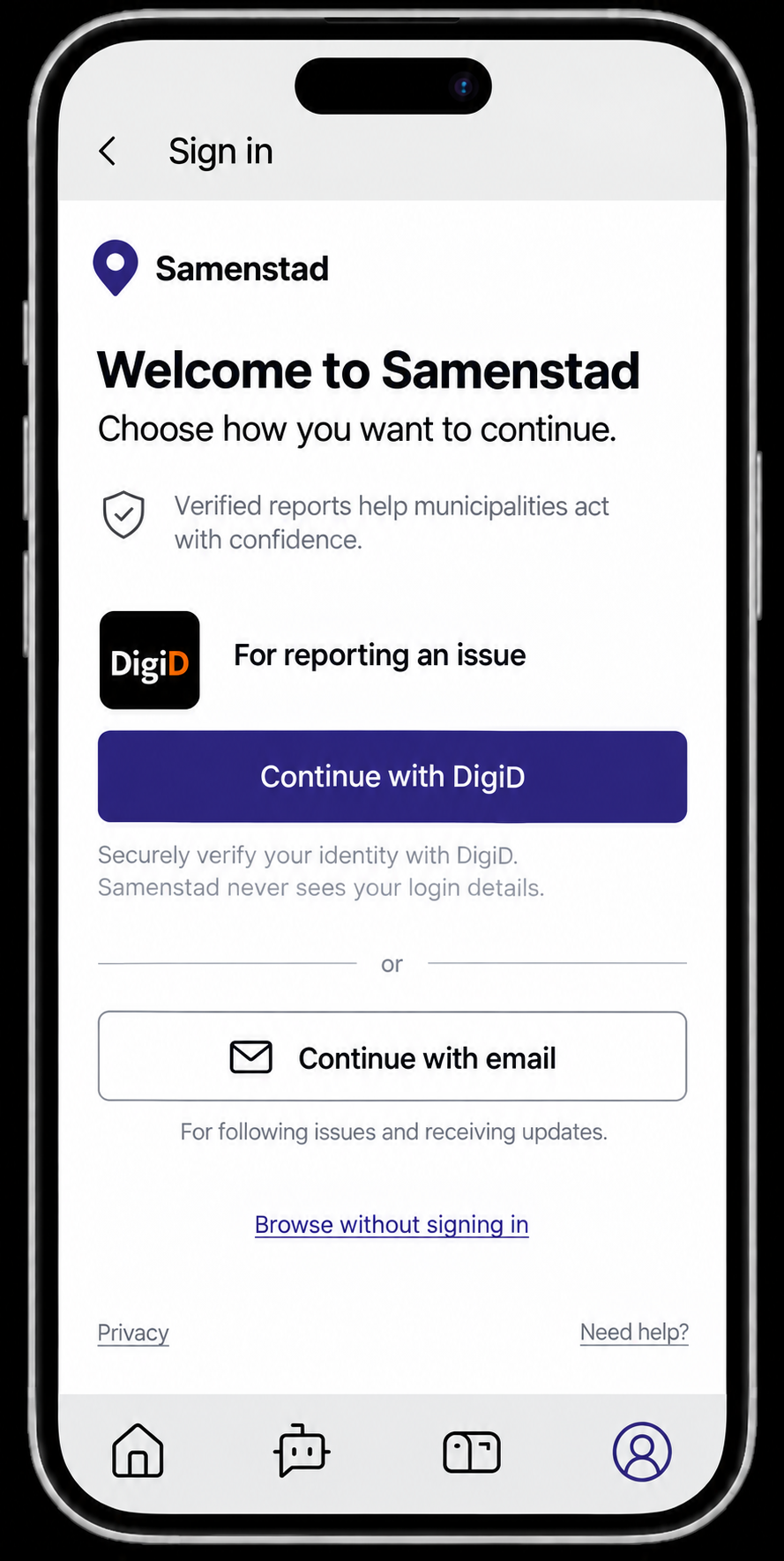
SIGN IN
DigiD primary · email secondary
Fig. 04 — Identity: why DigiD replaced the social buttons
Early sign-in explorations offered the usual Twitter and Facebook shortcuts. They were removed. A report that a municipality is expected to act on has to come from a real resident, so the primary route became DigiD — the national digital identity every Dutch adult already holds. It buys three things at once: verified residents instead of bots, a queue a civil servant can trust, and a sign-in step older users have already learned elsewhere. Email remains as a low-friction second route for browsing and following.
HOME
Map · search · voice
NEARBY — 1
Open issues, sorted by distance
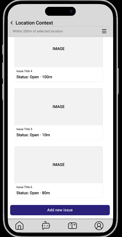
NEARBY — 2
Add new issue stays pinned
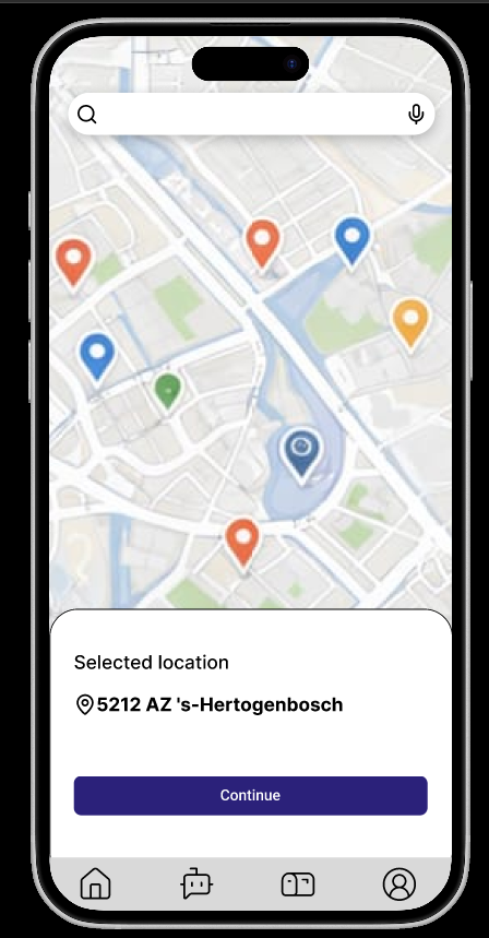
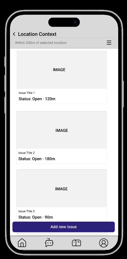
Fig. 05 — Home, and the screen that stops duplicates
The home screen holds one job and refuses every other: choose a place. Three equal ways in — type it, tap the map, or say it — so literacy, eyesight and motor control each have a route that works. Nothing else competes for attention; the four tabs sit quietly at the bottom. Press Continue and the app answers a question the user did not ask yet: here is what is already reported within 200 metres of you. Each card carries a photo, a status and a distance, and "Add new issue" stays pinned to the bottom of the list — available, but only after the street has been read.
INTERACTION DETAIL
The radius is set to 200 metres, not "nearby". It is roughly two Dutch city blocks — close enough that the issues shown are plausibly the same thing you are looking at, wide enough to catch a report pinned to the wrong side of the street.
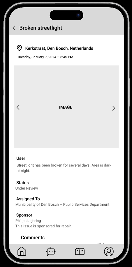
ISSUE PAGE — TOP
Evidence, status, owner, sponsor
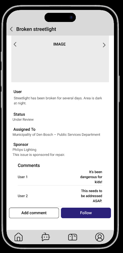
ISSUE PAGE — BOTTOM
Comments · Add comment · Follow
Fig. 06 — The issue page: the centre of the system
This is the screen the whole product exists to produce, so it answers the black-box finding line by line: where and when at the top, evidence in the photo carousel, the reporter's own words, then the three facts people said they never get — Status, Assigned to, and a named Sponsor. Below that the issue behaves like a place rather than a ticket: neighbours comment, and Follow puts it in your Activity so the next status change finds you. Nothing here is a private message to the city.
THE STATUS LADDER, VISIBLE TO EVERYONE
Reported → Under review → In discussion → Assigned → Sponsored → Resolved
Six states, written in plain language rather than municipal vocabulary, and identical for every issue in the city. "Sponsored" is the only state no other reporting app has — and it is the reason the ladder rarely stops at "In discussion".
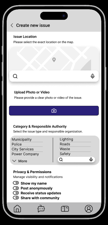
NEW REPORT — TOP
Location · media · category
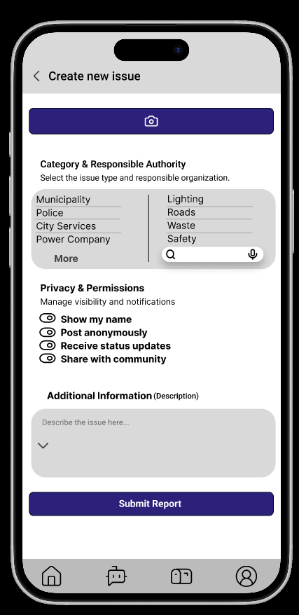
NEW REPORT — BOTTOM
Privacy · description · submit
Fig. 07 — The report form, reached only after the branch
Because the duplicate check already happened, the form can be short and honest. The two-column Category & Responsible Authority pairing is the v0.1 routing question rebuilt as a choice people can actually make: pick Lighting, pick Municipality — no judgement about jurisdiction required. Photo or video sits above the text, because a picture is faster than a paragraph and more useful to the crew that shows up. Privacy & Permissions stays on the same screen as the content it governs: show my name, post anonymously, receive status updates, share with community. Four switches, phrased as consequences, decided in the moment rather than buried in settings.
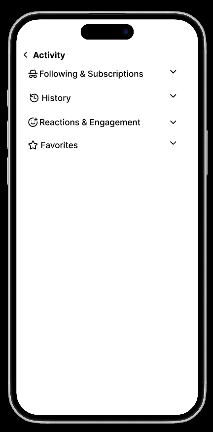
ACTIVITY
Following · History · Reactions · Favorites
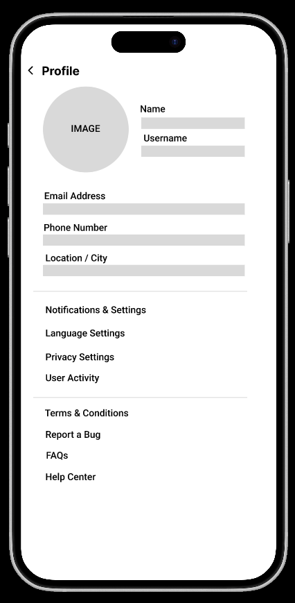
PROFILE
Identity · settings · support
Fig. 08 — Activity and Profile
In v0.1 this space was called "My reports" — a personal archive of things you had filed. Renaming it Activity was a small word change with a large consequence: it can hold the issues you follow but did not report, the replies you received, and the confirmations you gave, which is what participation in a neighbourhood actually looks like. Four collapsed groups keep it quiet until you open one. Profile stays deliberately plain — identity, then settings (notifications, language, privacy), then the boring-but-essential support block: terms, bug reporting, FAQs, help centre.
07 / THE SPONSOR LAYER
What to do when
the answer is "no budget"
The part of Samenstad that no other reporting app has — and the reason it is a startup rather than a portfolio exercise.
Research finding 04 was the hard one. A municipality can receive a perfect, verified, de-duplicated report and still not repair the thing, because the money for that category is gone until next year. Every reporting app in the country ends its story there.
Samenstad adds one more move. An accepted issue can be opened to a sponsor: a company that funds or carries out the repair, and in exchange places its design into that piece of the city — a bench, a light column, a planter, a wall. Not a billboard bolted on afterwards, but the object itself, made well and credited quietly. The municipality keeps approval and standards. The citizen gets the light back.
Scroll across to explore the full diagram →
WITHOUT A SPONSOR LAYER
WITH SAMENSTAD
Verified report
Municipal queue
"No budget this year"
THE STORY ENDS HERE
Verified report
+ 14 CONFIRMATIONS
Municipality opens
REPAIR BRIEF + STANDARDS
Sponsor takes it
FUNDS · BUILDS · CREDITED
Resolved — and visible
STATUS REACHES EVERY FOLLOWER
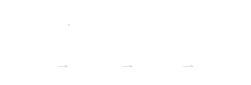
Fig. 09 — The move that keeps the ladder moving
The sponsor layer does not replace municipal responsibility; it gives an accepted-but-unfunded issue somewhere to go instead of quietly expiring.
Three parties, one exchange
Citizens
Report once, see everything already reported, and watch a named status move.
GIVE
Local evidence — photo, place, confirmation, context.
GET
A street that is repaired, and proof that reporting works.
Municipality
A clean, verified, de-duplicated queue — and a funding route for what the budget cannot reach.
GIVE
Status updates, ownership, approval and design standards.
GET
Fewer duplicates, DigiD-verified reporters, budget relief.
Sponsor
A company adopts a specific repair — not an ad slot, a piece of the city.
GIVE
Funding, materials or execution, to municipal standard.
GET
Credited presence in the street, and a visible local contribution.
The guardrails
01 The municipality always approves
A sponsor can offer; only the city can accept. Design standards for street furniture stay municipal, so the result looks like the city — not like a campaign.
02 Sponsorship is disclosed, in the open
The sponsor's name sits on the public issue page next to the status, visible to everyone following it. Nothing about the arrangement is private.
03 Safety issues are never left to the market
Categories that affect safety stay on the municipal track by default. The sponsor layer exists for the long tail — the benches, the lamps, the planters, the walls.
04 No resident data changes hands
Sponsors see issues, not people. Reporter identity is governed by the four privacy switches on the report form and nothing else.
08 / INCLUSION
Designed for the people
who need the pavement most
The residents with the strongest reason to report a broken street are often the ones a six-screen form quietly excludes.
Three ways to reach one place
Type an address, move the map, or hold the microphone and say it. Each entry point is complete on its own — none is a fallback for a "failed" attempt at another.
Voice as a first-class input
The microphone appears in the same field on the home screen, the location step and the category search — for tremor, for low vision, for anyone who finds typing an address on a phone in the rain absurd.
Photo before paragraph
The form accepts a picture and a category alone. A written description stays optional, so reporting never depends on how comfortably someone writes Dutch.
Status in words, not colour
Every state is spelled out — Open, Under review, Resolved — so the system never depends on a colour-coded pin being distinguishable.
One-thumb reach
Primary actions — Continue, Add new issue, Submit report, Follow — sit full-width at the bottom of the screen, where a thumb already is and where a large target is easiest to hit.
Anonymity without exclusion
"Post anonymously" keeps a verified DigiD report valid to the municipality while hiding the name from the street — so fear of neighbours is not a reason to stay silent.
09 / DESIGN SYSTEM
A civic palette,
not a brand palette
One indigo carries every action in the product. Colour is spent on the map, where it has a job to do.
INDIGO 800
#2F2A7C
Every primary action
SIGNAL RED
#D8432A
Roads & safety pins
SIGNAL BLUE
#1E6FD9
Water & lighting pins
SIGNAL AMBER
#D68A05
Waste pins
SIGNAL GREEN
#1B7E52
Green space · resolved
PAPER
#E6E6EC
Map ground · cards
Deep indigo does the work that municipal blue usually does, without looking like a government form. It stays legible against the map at small sizes, survives on both light and dark interface themes, and leaves the four signal hues free to mean something specific: on the home map, colour is data.
Report once
ARCHIVO
Headings, buttons, labels
600–800, tight tracking
A public object
NEWSREADER
Long-form reading
300–600, generous measure
200 m · 18:45
IBM PLEX MONO
Distance, status, metadata
Tabular figures
10 / WHERE IT STANDS
Built by two people,
now sitting across a table
Samenstad is a family startup. I lead product and experience design — the research, the architecture, the flows, the interface and the design system — and my co-founder builds and runs it. We work the way a two-person team has to: one conversation, one whiteboard, one decision, then straight into build.
The concept phase is finished. What we are doing now is the part a case study usually does not get to include: sitting down with the people who have to say yes. A reporting platform is worth nothing without the municipal side of the loop, and the sponsor layer is worth nothing without a first company willing to adopt a street. Those conversations are live, and they are shaping the next version — a municipal dashboard, a sponsor-facing view of open repairs, and a pilot in a single district before anything scales.
What happens next
01 Pilot district, not a city.
One neighbourhood in 's-Hertogenbosch, one category set, one municipal team — enough to measure duplicate rate and time-to-status honestly.
02 The municipal side of the loop.
A dashboard that turns confirmations into a priority signal, and makes updating a status a five-second job rather than a chore.
03 The sponsor view.
Open repairs, with cost, standards and visibility, presented so a local company can adopt one without a procurement process.
04 Usability testing where it matters.
Sessions with residents over 65 and with mobility-impaired users, on the street rather than at a desk — the two groups the flow is designed for and the two groups I have not yet watched use it.
05 DigiD integration in practice.
Moving from the designed sign-in to the real one, including what happens to people who do not have or do not want DigiD.
The hardest design decision was removing a question, not adding a screen.
REFLECTION
v0.1 asked citizens to decide whether their street needed the community or the city. Cutting that question — and replacing it with a structured category and a named authority — is the change the rest of the product grew out of. It moved the burden from the tired person at 18:45 onto the system, which is where it belongs.
If I started again, I would put the confirm action in front of real people sooner. It is the behaviour the whole model depends on, and it is the one behaviour I have so far only argued for on paper.
PROJECT
Samenstad
Civic reporting platform · 's-Hertogenbosch, NL
DESIGN
Romina Veisy
Founder · Product & UX design
ENGINEERING
Co-founder
Development & operations
STAGE
v1.0 concept complete
In partnership conversations
Archivo · Newsreader · IBM Plex Mono — Screens designed in Figma
samen + stad — your city, fixed together